
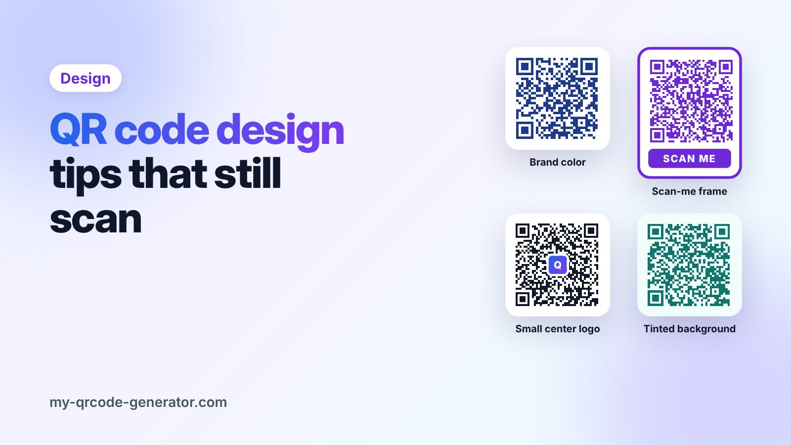
A plain black-and-white QR code works, but a code in your brand colors, with your logo and a clear "Scan me" frame, looks more trustworthy and usually gets more scans.
The catch: some design choices quietly break the code. Here are the rules that keep your QR code both on-brand and scannable.
1. Contrast comes first
Phones read a QR code by telling the dark squares apart from the light background. The bigger the difference, the faster and more reliable the scan.
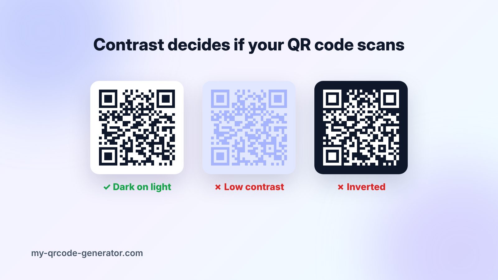
- Do: a dark code on a light background (dark blue on white, deep green on cream).
- Avoid: light colors for the code (yellow, light grey, pastel pink).
- Avoid: inverted codes (light code on a dark background). Many phone cameras struggle with them.
Quick test: convert your design to black and white. If the code still looks clearly dark on light, the contrast is fine.
2. Use your brand color for the code
You do not need black. Any dark brand color works well: navy, deep purple, dark green, maroon. If your main brand color is light (for example yellow or sky blue), use it in the frame or around the code, not for the code itself.
3. Keep the background plain
Put the code on a flat, solid color. Photos, gradients and patterns behind the code confuse the camera. A light tint of your brand color is fine as long as it stays light and even.
4. Add your logo the safe way
A logo in the center makes the code instantly recognisable. QR codes have built-in error correction, so they can still be read when part of the pattern is covered. There are four levels:
| Level | Data that can be lost |
|---|---|
| L | about 7% |
| M | about 15% |
| Q | about 25% |
| H | about 30% |
For a logo, use a high level and follow these rules:
- Keep the logo small, roughly a fifth of the code's width or less.
- Put it in the center, never over the three big corner squares.
- Give it a white or solid border so it does not blend into the pattern.
5. Never touch the corner squares
The three large squares in the corners tell the phone where the code is and which way up it is. Do not recolor them in a light color, round them off too much, or cover them with anything.
6. Use a frame with a call to action
A frame with a short message, such as "Scan me", "Scan for the menu" or "Scan for 10% off", tells people what they will get. In our generator you can add a Scan-me frame in one click when you design your code.
7. Leave a quiet zone
Every QR code needs a clear margin around it, called the quiet zone. Keep at least the width of four small squares empty on every side. Text, borders and images must not touch the code.
8. Print it big enough
Design means nothing if the code is too small to scan. Use at least 2 × 2 cm on print and follow the 10:1 rule: the scanning distance should be no more than about ten times the code's width. Our QR code size guide has a table for common materials.
9. Keep the content short
The more data a code holds, the more small squares it has, and the harder it is to scan when printed small or with a logo. A dynamic QR code only stores a short link, so the pattern stays simple no matter how long your real URL is.
Design checklist before you print
- Dark code on a light, plain background
- Logo small, centered, with high error correction
- Corner squares untouched
- Clear quiet zone on all sides
- A frame or line of text telling people why to scan
- At least 2 × 2 cm, larger for posters and banners
- Test-scanned with an iPhone and an Android phone, from the real distance
Ready to design yours? Open the QR code generator, pick your colors, add your logo and a Scan-me frame, and preview it before you download.
Frequently asked questions
Can a QR code be any color?
Yes, as long as the code is dark and the background is light with strong contrast. Light codes on dark backgrounds often fail to scan.
How big can a logo be in a QR code?
Keep it to roughly a fifth of the code's width, in the center, and use a high error correction level. Always test-scan after adding a logo.
Do designed QR codes expire?
No. Colors, logos and frames do not affect how long a code works. Whether it can be edited or tracked depends on whether it is static or dynamic.
Written by
My QR Code Generator Team
We build My QR Code Generator and help businesses create, design and track QR codes for menus, business cards, packaging and marketing campaigns. Every guide is based on what we see working for our users.
About My QR Code Generator